
Over the last year, gold has dropped in price and stocks have rallied in price. Consider what this may mean in terms of their relationship shown on this first chart.
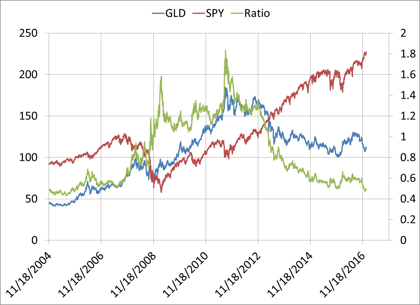
The chart shows Gold as measured by GLD (SPDR Gold Shares ETF, blue line left scale) and SPY (SPDR S&P 500 ETF, red line, left scale) and a ratio of price between the two (green line, right scale). Dividends are reinvested. The period is from 11/18/2004 through the present.
As you can see, the ratio between the two series has returned to where it was some 13 years ago. This ratio has fluctuated between 45% and 180% over this period. It suggests gold is once again cheap relative to stocks.
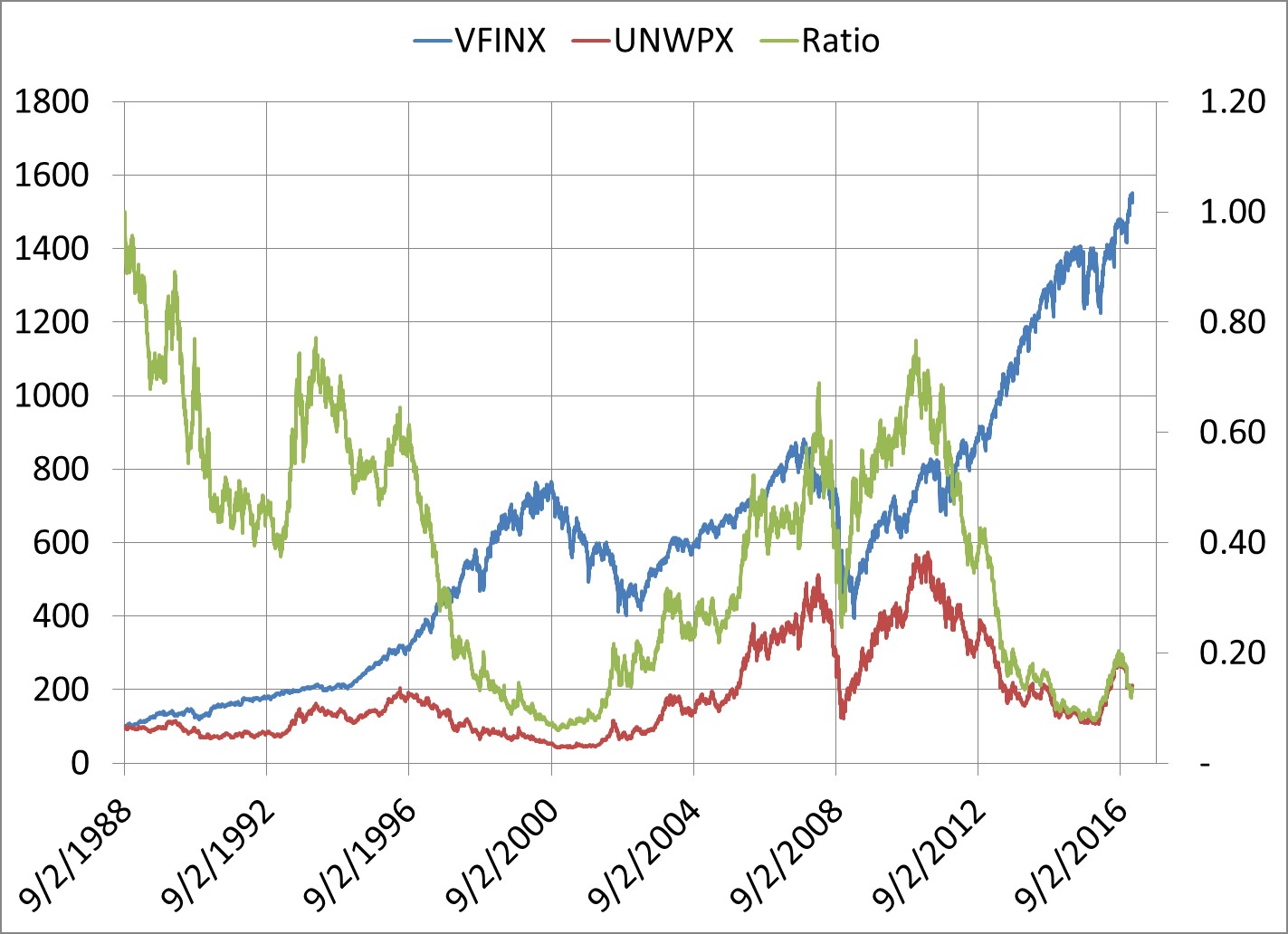
This next chart shows a much longer time period from 9/2/1988 through the present. The two series are basically the same as the first chart. They are VFINX (Vanguard Index 500 Fund) and UNWPX (US Global Investors World Precious Metals Fund). The chart also shows the ratio between the two funds. Dividends are reinvested.
Again, this second chart shows the same thing as the first chart. Gold is cheap relative to stocks.
An investment that is considered cheap is not necessarily a reason to buy. But there are a couple other reasons as well. For example, the question is whether world risk is increasing or decreasing? Has inflation begun to move up?
In our monthly and weekly letters, we track about 14 funds and ETFs in the precious metals sector. We suggest taking a look at the following funds.
Midas Fund (MIDSX)
US Global Investors World Precious Metals Funds (UNWPX)
PIMCO Commodity Real Return (PCRDX)
Rydex Precious Metals (RYPMX)
Relative to stocks, gold is once again nearly as cheap as it has ever been the last couple decades.